Widgets#
Tip
If you're looking for an index of all available widgets, see the Widget Index.
All individual graphical elements in magicgui are "widgets", and all widgets
are instances of magicgui.widgets.Widget. Widgets may be created
directly:
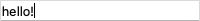
from magicgui.widgets import LineEdit

line_edit = LineEdit(value='hello!')
line_edit.show()
Some widgets (such as magicgui.widgets.Container) are composite
widgets that comprise other widgets:
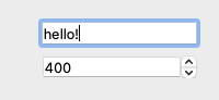
from magicgui.widgets import LineEdit, SpinBox, Container

line_edit = LineEdit(value='hello!')
spin_box = SpinBox(value=400)
container = Container(widgets=[line_edit, spin_box])
container.show()
magicgui provides a way to automatically select a widget given a python value
or type annotation using magicgui.widgets.create_widget. Here is an
example that yields the same result as the one above:
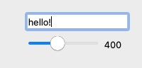
from magicgui.widgets import create_widget

x = 'hello!'
y = 400
container = Container(widgets=[create_widget(i) for i in (x, y)])
container.show()
Tip
Because there are often multiple valid widget types for a given python object,
you may sometimes wish to create widgets directly, or use the widget_type argument
in create_widget()
The widget hierarchy#
graph TB
    A([Widget])-->B([ValueWidget])
    A-->C([ContainerWidget])
    B-->D([RangedWidget])
    B-->E([ButtonWidget])
    B-->F([CategoricalWidget])
    C-->H([MainWindowWidget])
    C-->G([FunctionGui])
    D-->I([SliderWidget])
    click A "#widget"
    click B "#valuewidget"
    click C "#containerwidget"
    click D "#rangedwidget"
    click E "#buttonwidget"
    click F "#categoricalwidget"
    click H "#mainwindowwidget"
    click G "#functiongui"
    click I "#sliderwidget"
Many widgets present similar types of information in different ways. magicgui tries to maintain a consistent API among all types of widgets that are designed to represent similar objects. The general class of widget you are working with will determine the properties and attributes it has.
Note
The categories shown below are sorted by their base class (such as
ValueWidget and RangedWidget). The bases are
not intended to be instantiated directly. Instead, you would create the widget
type you wanted, such as LineEdit or SpinBox, respectively.
Widget#
As mentioned above, all magicgui widgets derive from magicgui.widgets.Widget and have the
following attributes (this list is not comprehensive, see
the magicgui.widgets.Widget API):
Attribute |
Type | Description |
|---|---|---|
name |
str |
The name or "ID" of this widget (such as a function parameter name to which this widget corresponds). |
annotation |
Any |
A type annotation for the value represented by the widget. |
label |
str |
A string to use for an associated Label widget (if this widget is being shown in a magicgui.widgets.Container widget, and container.labels is True). By default, name will be used. Note: name refers the name of the parameter, as might be used in a signature, whereas label is just the label for that widget in the GUI. |
tooltip |
str |
A tooltip to display when hovering over the widget. |
visible |
bool |
Whether the widget is visible. |
ValueWidget#
In addition to the base Widget properties mentioned above, the
following ValueWidgets track some value:
| Widget | Description |
|---|---|
Label |
A non-editable text display. |
LineEdit |
A one-line text editor. |
LiteralEvalLineEdit |
A one-line text editor that evaluates strings as python literals. |
Password |
A one-line text editor that obscures input. |
TextEdit |
A widget to edit and display both plain and rich text. |
FileEdit |
A LineEdit widget with a button that opens a FileDialog. |
RangeEdit |
A widget to represent a python range object, with start/stop/step. |
SliceEdit |
A widget to represent slice objects, with start/stop/step. |
DateTimeEdit |
A widget for editing dates and times. |
DateEdit |
A widget for editing dates. |
TimeEdit |
A widget for editing times. |
Table |
A widget to represent columnar or 2D data with headers. |
QuantityEdit |
A combined LineEdit and ComboBox to edit a pint.Quantity. |
Attribute |
Type | Description |
|---|---|---|
value |
Any |
The current value of the widget. |
changed |
psygnal.SignalInstance |
A psygnal.SignalInstance that will emit an event when the value has changed. Connect callbacks to the change event using widget.changed.connect(callback) |
bind |
Any, optional |
A value or callback to bind this widget. If bound, whenever widget.value is accessed, the value provided here will be returned. The bound value can be a callable, in which case bound_value(self) will be returned (i.e. your callback must accept a single parameter, which is this widget instance.). see ValueWidget.bind for details. |
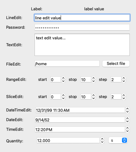
Here is a demonstration of all these:
from magicgui import widgets
import datetime

wdg_list = [
    widgets.Label(value="label value", label="Label:"),
    widgets.LineEdit(value="line edit value", label="LineEdit:"),
    widgets.Password(value="super-secret!", label="Password:"),
    widgets.TextEdit(value="text edit value...", label="TextEdit:"),
    widgets.FileEdit(value="/home", label="FileEdit:"),
    widgets.RangeEdit(value=range(0, 10, 2), label="RangeEdit:"),
    widgets.SliceEdit(value=slice(0, 10, 2), label="SliceEdit:"),
    widgets.DateTimeEdit(
      value=datetime.datetime(1999, 12, 31, 11, 30), label="DateTimeEdit:"
    ),
    widgets.DateEdit(value=datetime.date(81, 2, 18), label="DateEdit:"),
    widgets.TimeEdit(value=datetime.time(12, 20), label="TimeEdit:"),
    widgets.QuantityEdit(value='12 seconds', label="Quantity:")
]
container = widgets.Container(widgets=wdg_list)
container.max_height = 300
container.show()
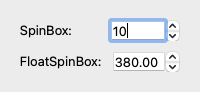
RangedWidget#
RangedWidgets are numerical ValueWidgets that have a restricted range of valid
values, and a step size. RangedWidgets include:
| Widget | Description |
|---|---|
SpinBox |
A widget to edit an integer with clickable up/down arrows. |
FloatSpinBox |
A widget to edit a float with clickable up/down arrows. |
In addition to all of the ValueWidget attributes, RangedWidget attributes include:
Attribute |
Type | Description |
|---|---|---|
min |
float |
The minimum allowable value, by default 0 |
max |
float |
The maximum allowable value, by default 1000 |
step |
float |
The step size for incrementing the value, by default 1 |
range |
tuple of float |
A convenience attribute for getting/setting the (min, max) simultaneously |
w1 = widgets.SpinBox(value=10, max=20, label='SpinBox:')
w2 = widgets.FloatSpinBox(value=380, step=0.5, label='FloatSpinBox:')
container = widgets.Container(widgets=[w1, w2])
container.show()
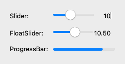
SliderWidget#
SliderWidgets are special RangedWidgets
that additionally have an orientation, and a readout.
| Widget | Description |
|---|---|
Slider |
A slider widget to adjust an integer value within a range. |
FloatSlider |
A slider widget to adjust an integer value within a range. |
LogSlider |
A slider widget to adjust a numerical value logarithmically within a range. |
ProgressBar |
A progress bar widget. |
In addition to all of the RangedWidget attributes, SliderWidget attributes include:
Attribute |
Type | Description |
|---|---|---|
orientation |
str |
The orientation for the slider. Must be either 'horizontal' or 'vertical'. by default 'horizontal' |
readout |
bool |
Whether to show the value of the slider. By default, True. |
w1 = widgets.Slider(value=10, max=25, label='Slider:')
w2 = widgets.FloatSlider(value=10.5, max=18.5, label='FloatSlider:')
w3 = widgets.ProgressBar(value=80, max=100, label='ProgressBar:')
container = widgets.Container(widgets=[w1, w2, w3])
container.show()
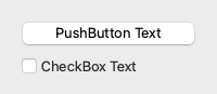
ButtonWidget#
ButtonWidgets are boolean ValueWidgets that also have some
text associated with them.
| Widget | Description |
|---|---|
PushButton |
A clickable command button. |
CheckBox |
A checkbox with a text label. |
In addition to all of the ValueWidget attributes, ButtonWidget attributes include:
Attribute |
Type | Description |
|---|---|---|
text |
str |
The text to display on the button. If not provided, will use name. |
w1 = widgets.PushButton(value=True, text='PushButton Text')
w2 = widgets.CheckBox(value=False, text='CheckBox Text')
container = widgets.Container(widgets=[w1, w2])
container.show()
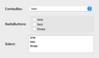
CategoricalWidget#
CategoricalWidget are ValueWidgets that provide a set
of valid choices. They can be created from:
- an
enum.Enum - an iterable of objects (or an iterable of 2-tuples
(name, object)) - a callable that returns an
enum.Enumor an iterable - a
typing.Literalannotation.
| Widget | Description |
|---|---|
ComboBox |
A dropdown menu, allowing selection between multiple choices. |
RadioButtons |
An exclusive group of radio buttons, providing a choice from multiple choices. |
Select |
A list of options, allowing selection between multiple choices. |
In addition to all of the ValueWidget attributes, CategoricalWidget attributes include:
Attribute |
Type |
Description |
|---|---|---|
choices |
Enum, Iterable, or Callable |
Available choices displayed in the widget. |
value |
Any |
In the case of a CategoricalWidget the value is the data of the currently selected choice (see also: current_choice below). |
current_choice |
str |
The name associated with the current choice. For instance, if choices was provided as choices=[('one', 1), ('two', 2)], then an example value would be 1, and an example current_choice would be 'one'. |
choices = ['one', 'two', 'three']
w1 = widgets.ComboBox(choices=choices, value='two', label='ComboBox:')
w2 = widgets.RadioButtons(choices=choices, label='RadioButtons:')
w3 = widgets.Select(choices=choices, label='Select:')
container = widgets.Container(widgets=[w1, w2, w3])
container.max_height = 220
container.show()
ContainerWidget#
A ContainerWidget is a list-like Widget that can contain other widgets.
Containers allow you to build more complex widgets from sub-widgets. A notable
example of a Container is magicgui.widgets.FunctionGui)
(the product of the @magicgui decorator).
| Widget | Description |
|---|---|
Container |
A Widget to contain other widgets. |
MainWindow |
A Widget to contain other widgets, includes a menu bar. |
FunctionGui |
Wrapper for a container of widgets representing a callable object. |
Attribute |
Type | Description |
|---|---|---|
layout |
str |
The layout for the container. Must be either 'horizontal' or 'vertical'. |
widgets |
Sequence[Widget] |
The widgets that the container contains. |
labels |
bool |
Whether each widget should be shown with a corresponding Label widget to the left. Note: the text for each widget defaults to widget.name, but can be overridden by setting widget.label. |
Container implements the full collections.abc.MutableSequence interface.
You can add and remove widgets from it just as you would add or remove items from a list.
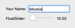
from magicgui.widgets import Container, Slider, FloatSlider, ProgressBar

container = widgets.Container()
container.append(widgets.LineEdit(value='Mookie', label='Your Name:'))
container.append(widgets.FloatSlider(value=10.5, label='FloatSlider:'))
container.show()
MainWindowWidget#
A MainWindowWidget is a special type of ContainerWidget that also includes a menu
bar.
FunctionGui#
A FunctionGui is a special type of ContainerWidget
that is created from a function. It is the product of the
@magicgui decorator. It is a container that contains a
widget for each of the parameters in the function.
See magicgui.widgets.FunctionGui for details.
@magicgui#
It's worth noting that @magicgui and
@magic_factory decorators are just conveniences
that build a special type of Container widget (a
FunctionGui), with a widget representing each of the
parameters in a decorated function.
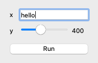
from magicgui import magicgui

@magicgui
def my_function(x='hello', y=400): ...

my_function.show()
In terms of simply building widgets, the following code performs a similar task
to @magicgui.
from inspect import signature

def my_function(x='hello', y=400):
  ...

params = signature(my_function).parameters.values()
container = Container(
    widgets=[create_widget(p.default, name=p.name) for p in params]
)
container.show()
Tip
Note that the FunctionGui widget
produced by @magicgui is actually a callable object that behaves very
much like the original function, except that it will use current values from
the GUI as default parameters when calling the function.